CASE STUDY
Chicago Adaptive Reuse
Residential and Commercial 3-Flat Renovation
m+ services provided
Residential Design
Office Design
Interior Design
Interior Architectural Design
Architectural Renovation
Landscape Design
Deck Design
Specifications
Project Coordination
Construction Observation
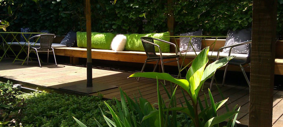
Garden lounge bench
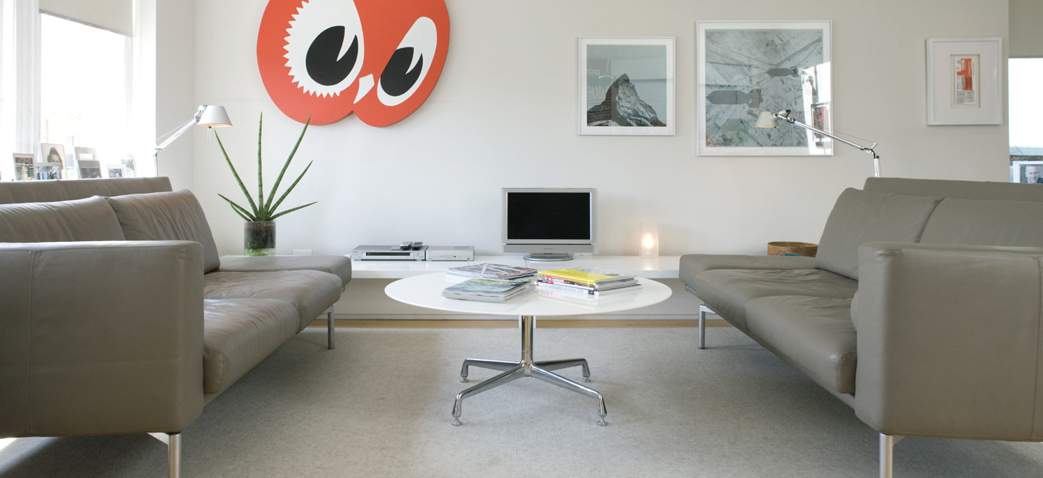
Third floor living
overview
Thousands of shotgun flat commercial buildings dot the City of Chicago. These substantial brick buildings were designed and built by and for the multitude of European immigrants arriving in Chicago at the beginning of the 20th century. The flat’s design is based on a common, urban European building model that provides apartments above commercial storefronts, allowing tradespeople to house their businesses and extended family within one building along commercial thoroughfares.
The term “shotgun” refers to the long, narrow building footprint and interior layout where rooms are stacked upon rooms running front to back. Now, one hundred years later as the need for practical and sustainable considerations have become more demanding, the reuse of existing buildings is developing into a moral and economic necessity. For a designer in Chicago, the shotgun flat provided the perfect motivation to create a modern and relaxing home by taking lifestyle cues from the past.
Tom Marquardt, President and Founder of marquardt+ (m+), purchased the Chicago shotgun flat in the transitioning, historic neighborhood of Logan Square to house the m+ studio, provide an affordable rental unit for income and friends, and to create a home for himself. The third floor flat was earmarked to become Tom’s private retreat. The design challenge faced by m+ was to maintain the sense of procession, proportion, and verticality of the original spaces with minimal intervention, while transforming the building into a soft, modern, simple, and efficient home while providing a modern utilitarian workspace expanding into a shared private exterior oasis.
The solution was to create a civilized space designed to reflect the users' functions, and to provide both separation and integration of personal and professional life in line with the building's original intent.
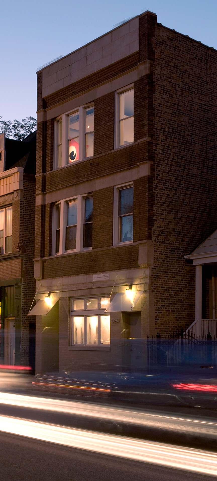
Building exterior
residence
For the 3rd floor, the original six-panel oak entry door and transom were relocated to the 2nd floor landing. This expanded the 3rd floor by gaining the public foyer, skylight, and staircase as private space. The new stair shaft opening was lined with unframed glass railing bisected by a freestanding glass-faced fireplace. The redesign utilized the original hardwood floors along with the window locations and openings. To bring in additional light and air for the east the bedroom and pantry, windows were expanded vertically with stacked operable casement windows.
The bathroom was enlarged toward both the dining area and hallway. A translucent textured glass wall was inserted to open the bath space and bring in additional natural light. The bathroom became a self-contained wet space with a trough drain and solid surface material sliding door. A custom mirror faced waterproof millwork cabinet runs the width of the opposite wall. The ceiling is tinted plaster to resist water damage and soften the space. The bathroom floor and wall tile wraps the outside of the bathroom to define the room as a box, separating the front and rear areas of the flat.
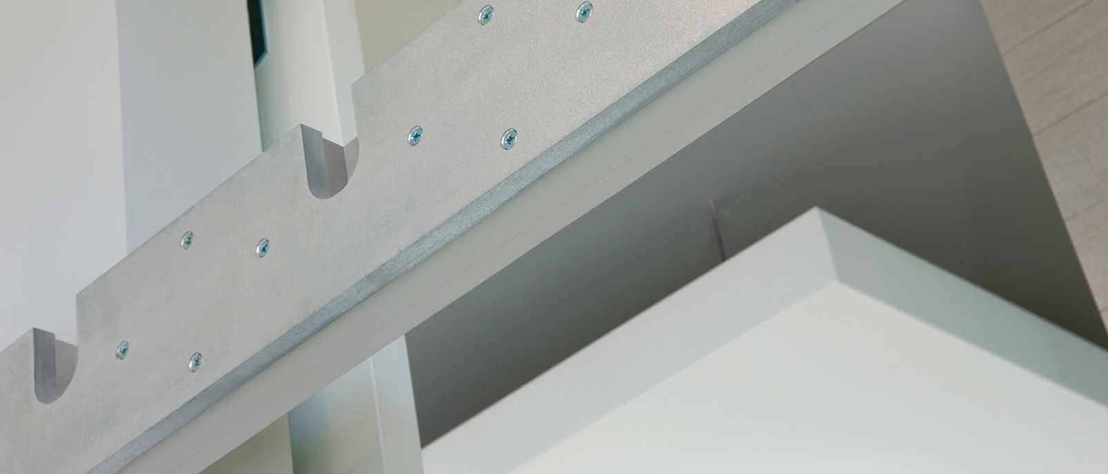
The interruption created by the bathroom box is further exaggerated by (2) suspended drywall ceiling planes running from the front to the back of the flat. The planes define and hold the kitchen and dining/living room areas more intimately without losing the effect of the high ceilings above. All door and closet openings were raised to nine feet, and the wall shared by the kitchen and rear bedroom was eliminated. When bedroom privacy is required, large custom millwork barn doors can be rolled across the openings on a continuous steel rail running lengthwise across the space. Each bedroom has custom built-in millwork beds with full-depth, rolling storage drawers, and built-in leather padded headboards with matching surrounds. Both bedroom closets have custom pin mounted full height mirror surfaced doors for full closet access and expansion of light and space.
The kitchen includes custom designed stainless steel, freestanding counters, and an island with an integrated sink and stovetop. Office cubicle overhead storage units with task lighting, lateral file cabinets, and commercial wire shelving supplement the walk-in pantry storage. A custom steel stand holds the wall oven and dishwasher while a high efficiency front-load washer and dryer rest under the counter. The windows at the rear act as a service pass through with custom stainless steel removable ledges for dinner and drinks on the rear porch with views of the private garden below.
office space
A flexible, multifunctional, utilitarian budget-minded program drove the first floor renovation. Opening all the walls brought light in from the front and rear of the building. Shelving is installed across the space, eliminating the need for a reference library while maximizing immediately accessible storage.
All the workspace walls were removed to create an open office. The original tin ceiling was maintained and painted silver. The bathroom was economically refitted and finished to be fresh and utilitarian with a full bath and shower, should the space eventually become a live/work studio in the future. A simple service kitchen was added for team use and event prep. A counter height meeting table was added at the rear for team meetings, a break area, and food staging, with a light lab track for color and material work suspended above.
Two huge custom built tables were built to maximize desk space for team ebb and flow, allowing desk space for up to 20 people. They were created out of solid core doors, cut, assembled, sanded, and stained in place with built-in power and wire management. With a center spin support panel, they provide pull up teaming on both sides and a wide long space to lay out drawings and other work. Aluminum framed translucent privacy panels visually block the entry and the equipment area while letting light permeate the space.
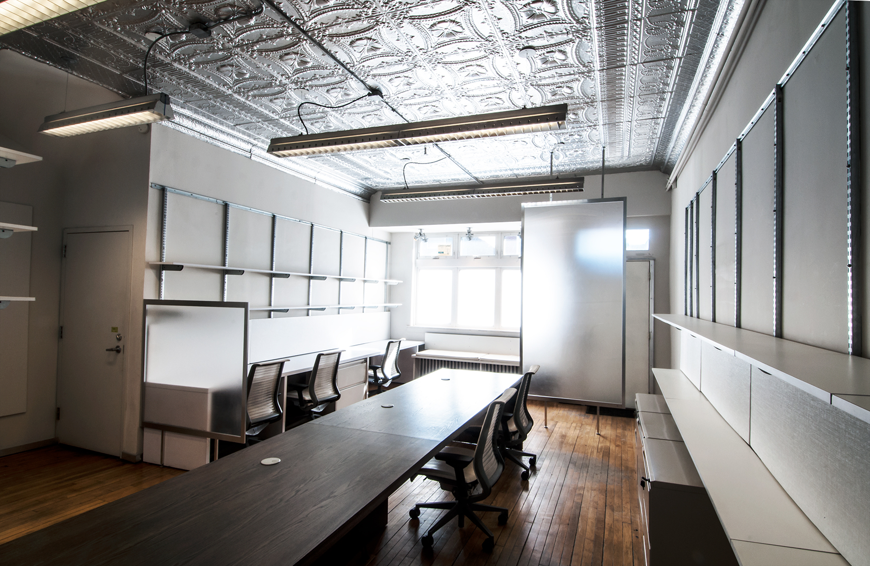
Buffered entryway
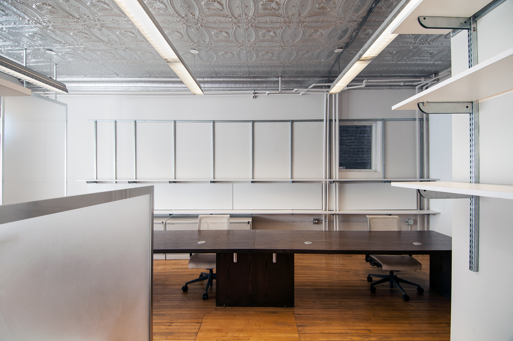
Work area with flexible shelving
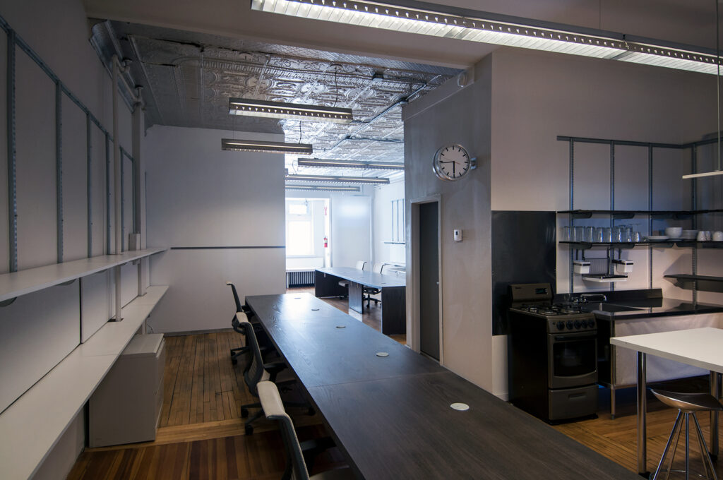
Two custom-built work tables
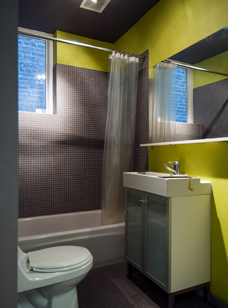
Office bathroom
Deck towards office entry
garden and deck
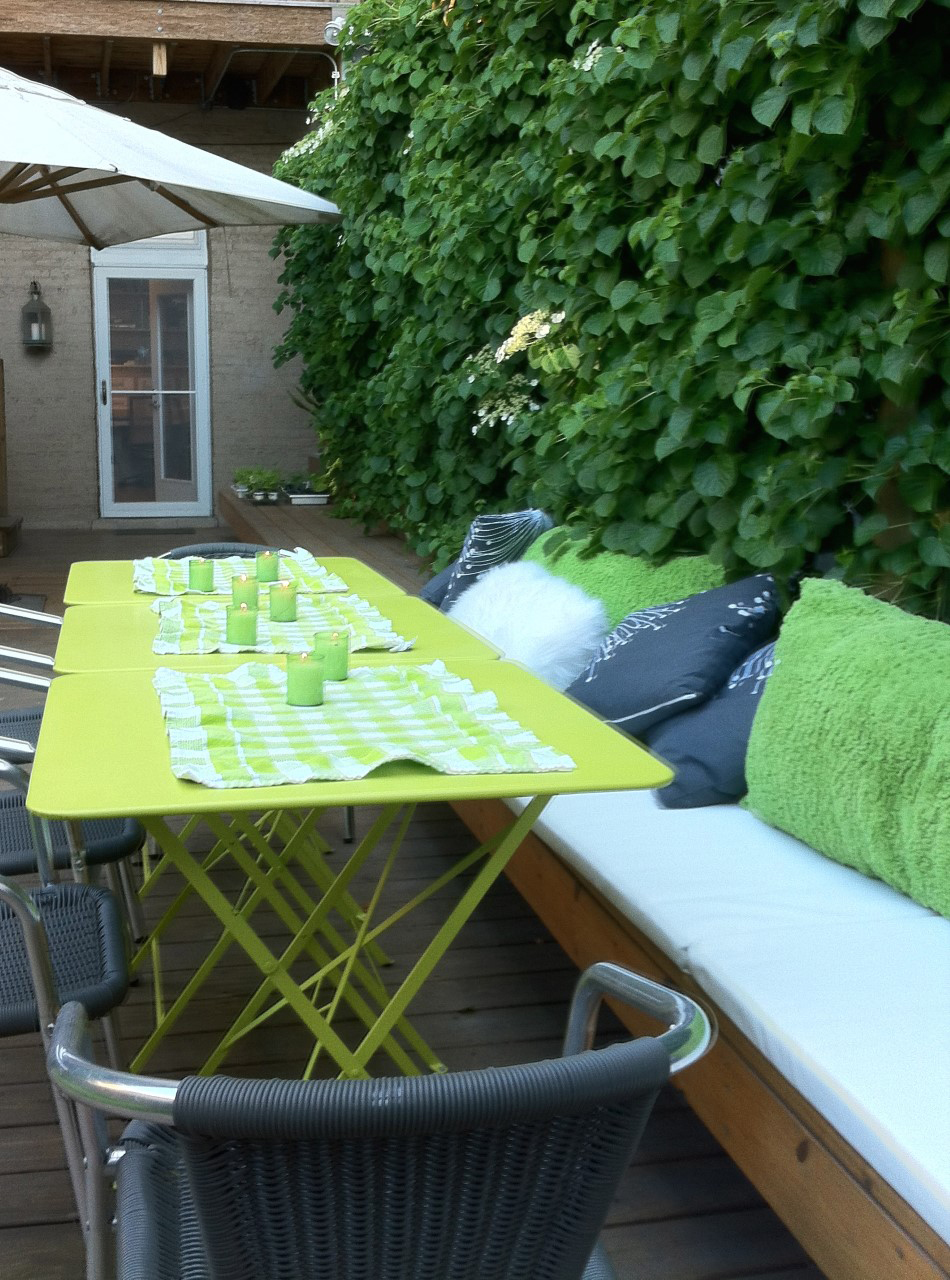
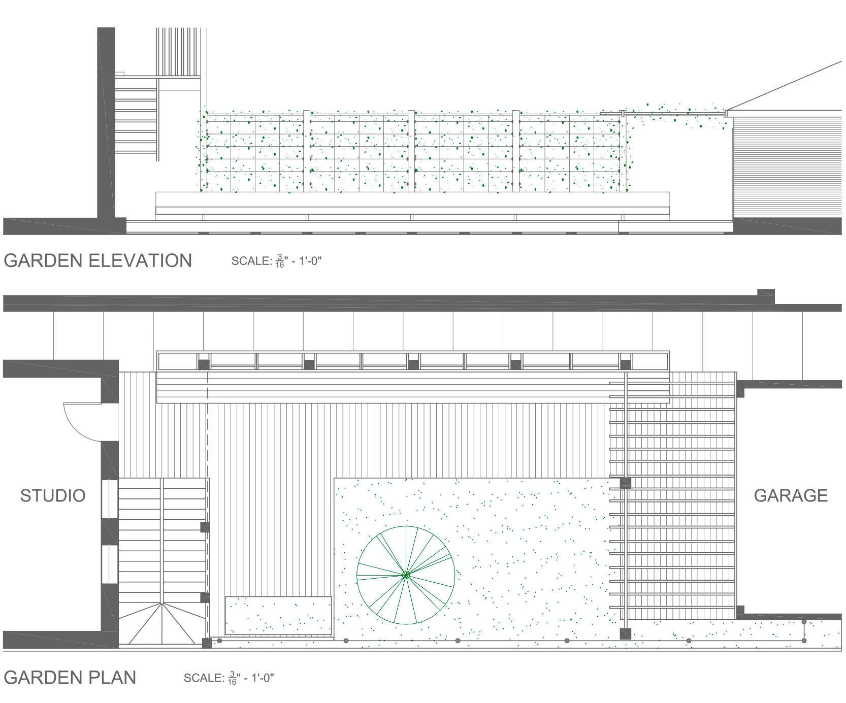
This private garden space was created to provide much needed respite green space from the city, for the team to work outside in good weather and to extend a natural living space for the residents. The old crab grass and wilting garden was removed, and a long deck was designed to variegate the rear yard into halves from the building to the new double opening garage. The yard was low and below the building and garage opening, so the deck is elevated to run flush from the new garage floor to the rear door entry, providing ADA access to the office. A large spruce and scrub pine were maintained, and an 9’ tall arbor was built with posts 40 feet from the new rear porch stairs to a horizontal arbor of galvanized steel posts and wood built onto the new garage. Later, a 40’ super bench was added to facilitate a working lounge cafe feel. The arbor was filled with original grape vines pulled up from the original fence along the east edge of the lot, planted by the first owner over 90 years ago, and now flourishes to create a horizontal green canopy over the rear at the deck.
The yard was planted with aggressive shade plants that can withstand the high acid soil and lack of natural light due to the pine trees and adjacent buildings. The end result is a small urban forest floor, with a privacy green wall of climbing hydrangeas, juxtaposed at the far end with a flat ceiling plane of Thompson grapevines, mixing an architectural experience with the organic.

From Left to Right: View from rear porch; Grape arbor at garage; Outdoor cafe work set-up, Grape arbor detail
the end result
Overall, a restricted palette of color and off-the-shelf materials were selected for the building to maintain a quiet, relaxing, approachable atmosphere as well as a warm, neutral backdrop for the owner’s art collection and furniture on the third floor and a visual calm for the first floor office and yard.
Soft grey, beige, taupe, and white paint, as well as lacquer, leather, steel, glass, and solid surface materials coordinate with the natural tones of the original hardwood floors. Hardware, fixtures, and lighting were selected to maintain a modern yet timeless restraint. The result is a sophisticated, clean, yet informal enclave for relaxation, comfort, work and entertainment that respects what is best about the building and history, yet provides a way of living by looking forward through the past.
design team, marquardt+ (work performed as Design Collaboratives)
+ Tom Marquardt
+ Vince Gammino
+ Billie Knipfer
+ Kelly Ziegenhagen
+ Gretchen Miller
+ Gisele Gieger
Photography: marquardt+, Michelle Litvin Photography, Jayson Goranson Photography
