CASE STUDY
Atlas Carpet Mills, Inc.
m+ services provided
Architectural Design Renovation
Interior Renovation
Interior Architectural Design
Interior Design
Workplace Design
Landscape Design
Showroom Design
Floral Design/Plant Specifications
Exhibit Design
Product Display
Product Display Strategy
Product Design Consulting
Product Color Consulting
Communication Design
Graphic Design
Environmental Graphics
Brand Strategy
Marketing Strategy
Print Brochures and Promotions
Communication Design
Copywriting
Custom Furniture Design
Custom Hardware Design
Custom Display Design
Custom Exhibit Design
Product Photography Standards
Photoshoot Directing
Project Coordination
Construction Observation
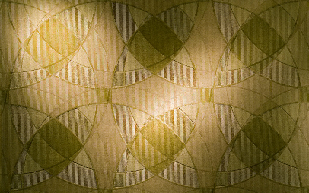
Energy Broadloom, EG13 Lime Twist, Broadloom, 39 oz weight Ultraweave 5/64th true cut and loop pattern with four color yarn set up
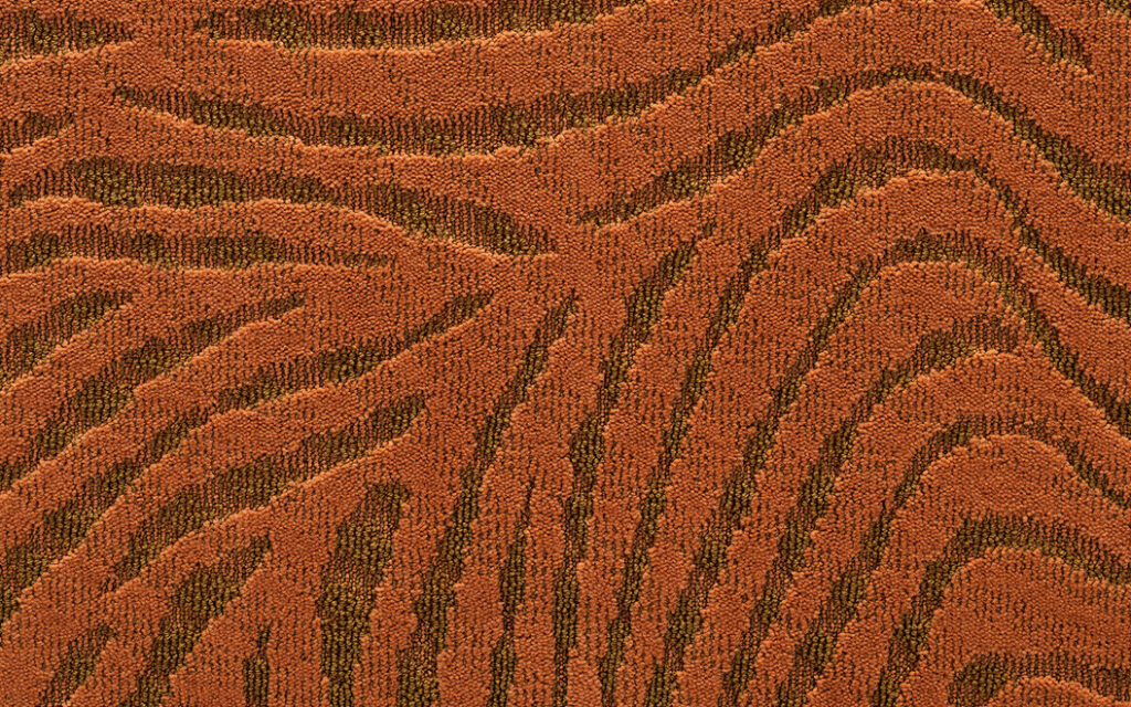
Ancien, AE07 Orange Blaze, Broadloom, 31 oz weight Ultraweave 5/64th true cut and loop pattern with three color yarn set up
description
marquardt+ (as Marquardt Design Collaboratives, Design Collaboratives, Inc and marquardt+) was first retained in 1995 to design a one-off tradeshow installation reflective of the Atlas Carpet Mills marketing strategy. Following that process, m+ was asked to partner with the company on subsequent projects and continuously supported Atlas thru the completion of their acquisition by Dixie Group in 2018.
The company was looking to transform their product offering and brand perception from that of a conventional commercial carpet mill to the premiere boutique commercial carpet mill of creative design and innovation in the Architecture and Design (A&D) industry.
Led by President Jim Horwich and Vice-President Mark Nestler, the Atlas Carpet Mills product development team experimented with the conventions of piece dyed product processes and tufting technologies to reveal new patterns, constructions and expansive color ways few of their competition could match.

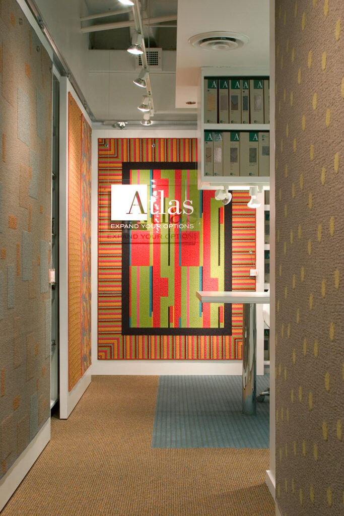
Product as brand hero
marketing strategy
Because Atlas Carpet Mills relied on their product as hero and the selling point of their marketing, they chose not to focus on advertising or aggressive promotions. This put a major emphasis on their product itself in competitions, photography, showroom presentations, sales presentations and mill tours, with less emphasis on a written narrative approach.
Thus marquardt+ was tasked with responsibilities to create clear and visual strategies to express their product design and experimentation as an experience in their buildings, tradeshow and showroom spaces, product displays, digital and print sales tools, as well as product development advisement with their design team.
We utilized the design inspiration, pattern, construction and colorway development of each year’s introductions to inform each project. m+ focused on the creativity of their processes that these inherent visual elements spoke to in themselves, and created a tagline to support each year’s product launches and focus that would be featured in PR and all accompanying materials.
tradeshow exhibit
marquardt+ was hired for the first tradeshow exhibit for Atlas Carpet Mills. After meeting with them in Los Angeles and understanding their intent as a company, we determined that a one-off installation was the solution, made completely out of their carpet product, including enclosure with vertical carpet panels.
Our design for Atlas was the first temporary exhibit at the Mart to remove the show space carpet and install the client’s carpet product. We also negotiated with the Mart to turn off the general fluorescent lighting over the Atlas exhibit space so we could control the illumination with more professional track lighting, which staged the space and emphasized the true construction and colors of the product. We also were the first to completely enclose the space with product, utilizing a custom neutral fabric scrim as a backdrop. Beyond identity, carpet tags and a ledge with carpet books, there were no other elements in the space.
The result was a finished, sophisticated, on-brand showroom experience in a temporary space. Our work with Atlas actually influenced the show management to provide these options in their rules and offerings to all their temporary exhibitors at NeoCon over the years as our installation stood out by making these simple yet effective moves, and by doing so elevated the show itself.
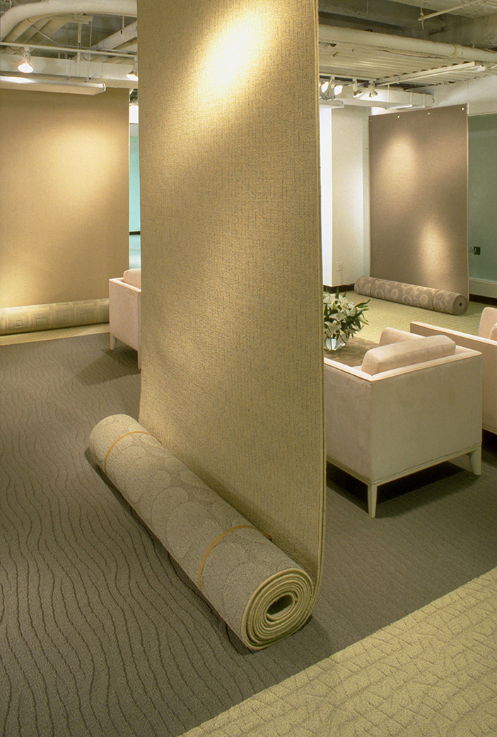
Tradeshow exhibit display detail showing pattern coordination
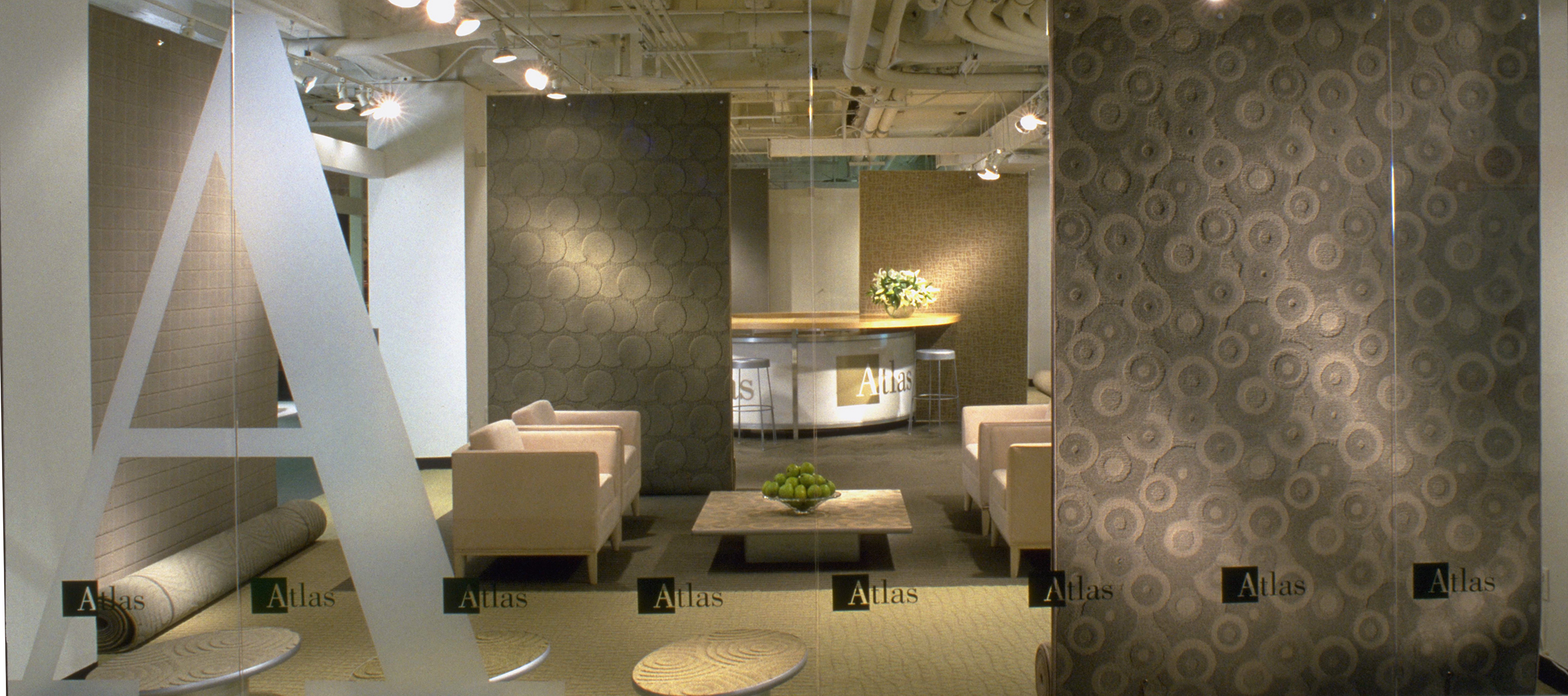
Overall tradeshow exhibit display
For subsequent shows we created a large, round, shippable tradeshow engagement desk for meetings, product discussions, carpet books, storage and a self-supporting panel system. We continued to encourage Atlas to utilize the carpet itself in the largest sample proportions possible as dividers and organizers of collections, as no other companies were doing at the time.
Over the years we created a number of different and minimal display armature systems that would fade back and allow the product to be hero, supporting large samples and a per show flooring pattern design of multiple products collections in coordinated patterns and color schemes. This provided a visual narrative as a sales tool for the sales team, while creating a unified display and singular experience that is at once Atlas.
Finally, marquardt+ was asked to create FedEx shippable custom tradeshow pop-ups that a single sales person could receive, set up and take down by themselves for smaller shows. We designed individual custom flat-pack units of panels with pressure clips for easy assembly of a rolling box counter with casters, including a slip in hanging armature with integrated lighting for signage and larger samples. These units could be used singly or ganged and set-up and taken down in an hour, and easily handled by one person.

One of three tradeshow pop-ups designed to be simple to ship and assemble by salesperson
company headquarters, manufacturing, and R&D building renovation
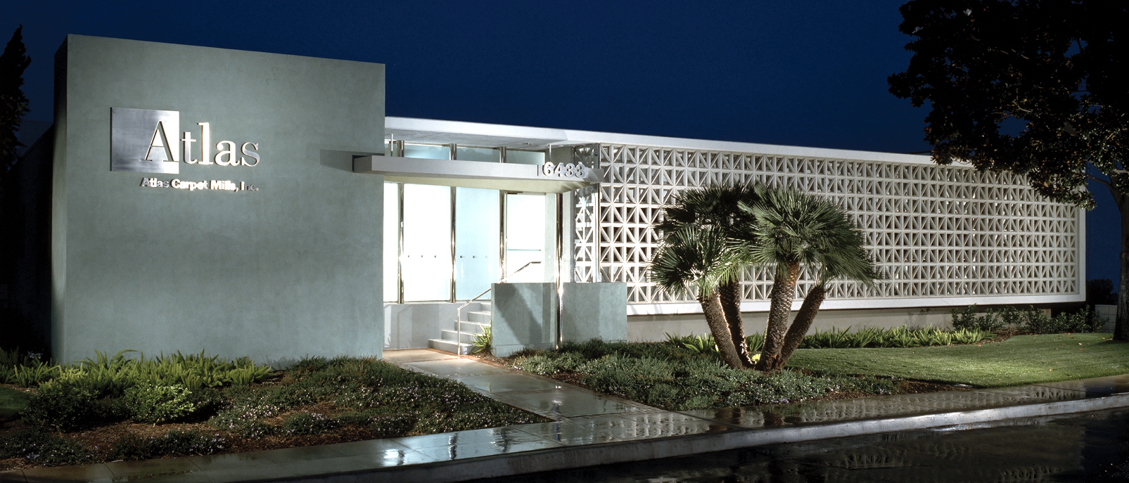
Our first major corporate architectural and interiors renovation came with the repositioning of the Atlas Carpet Mills headquarters and A&D research facilities in Los Angeles. The company’s goal for these renovations was to develop facilities that were more conducive to their operational workplace and product development processes. This also included their desire to increase designer and specifier manufacturing tours.
Atlas needed the facilities to portray the brand truth of the company as simple yet forward thinking, with the facilities to become a modern, neutral backdrop that allowed the products to be hero and the focus within the architecture and interiors. We chose to embrace and emphasize the Southern California midcentury almost Japanese qualities of the original architecture, buried until now in multiple piecemeal renovations. Our goal was to recapture what was most resolved in the original building designs while updating them to be more forward thinking, not nostalgic restorations.
Headquarters and R&D building renovations
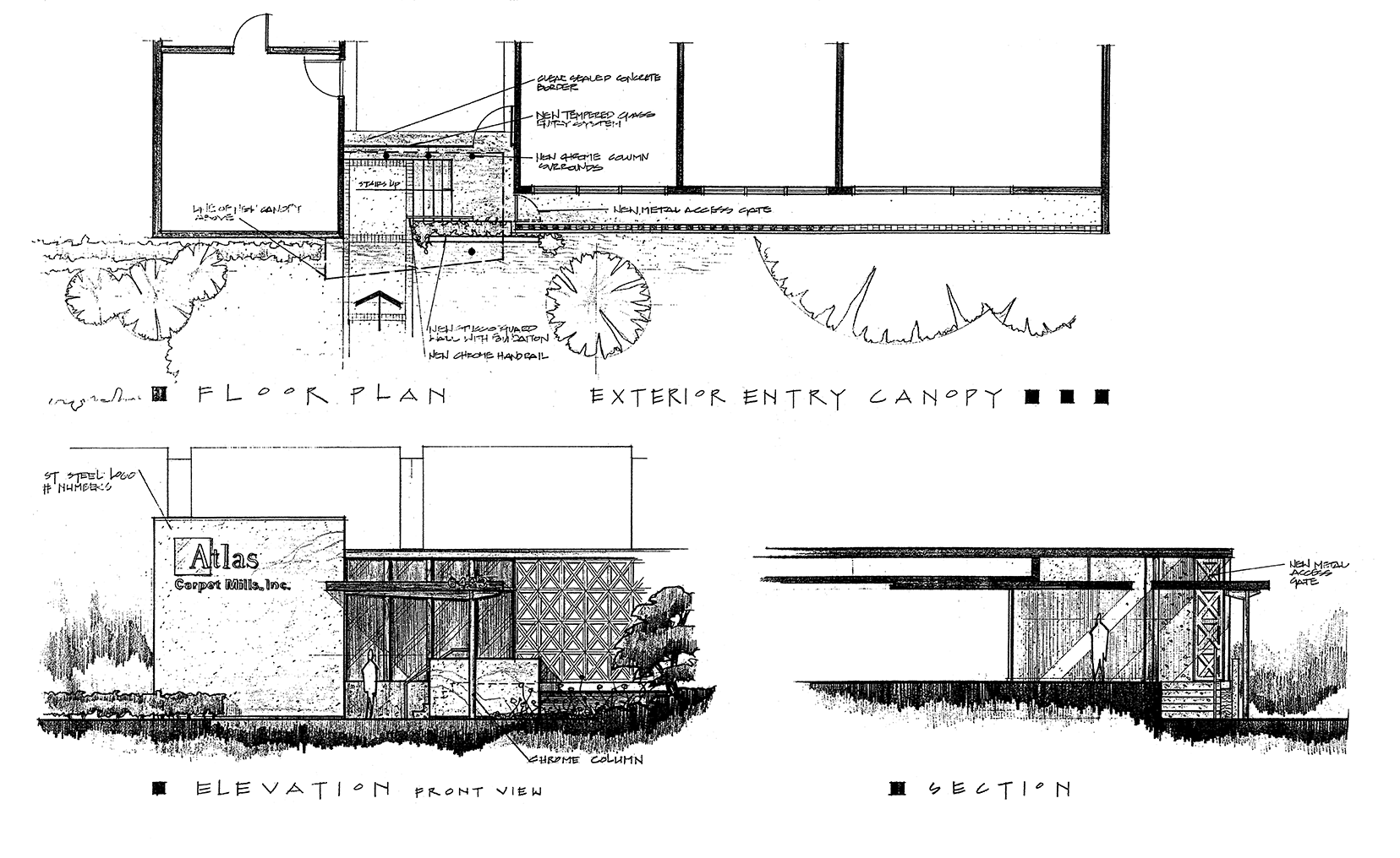
R&D renovation concept drawings
Our workplace programming unearthed the authentic, experimental yet modest family workplace culture of the company which had little hierarchy. The majority of the employees had been with the company long-term and their loyalty was reinforced by the leadership developing talent from within. In return, Atlas took care of their people and thus had a mutual commitment to their work and the creative freedom they provided.
Atlas interior office spaces
We approached the buildings as basic research labs, where leadership and the design teams freely experimented and operations/product development were intertwined. Reflecting the neutrality of the Atlas brand colors, we provided a grey/beige and soft green backdrop, designed completely customized desking, and were responsible for all other exterior and interior work throughout the facilities. The final solution provided heads down focus spaces and supported informal unplanned and planned interactions with a simple, minimal interior that kept the focus on the flooring installed and in development.
We also addressed the landscaping at both facility locations utilizing native plants with colors and textures in an experiential way to reflecting the creative product color, pattern and construction development occurring inside!
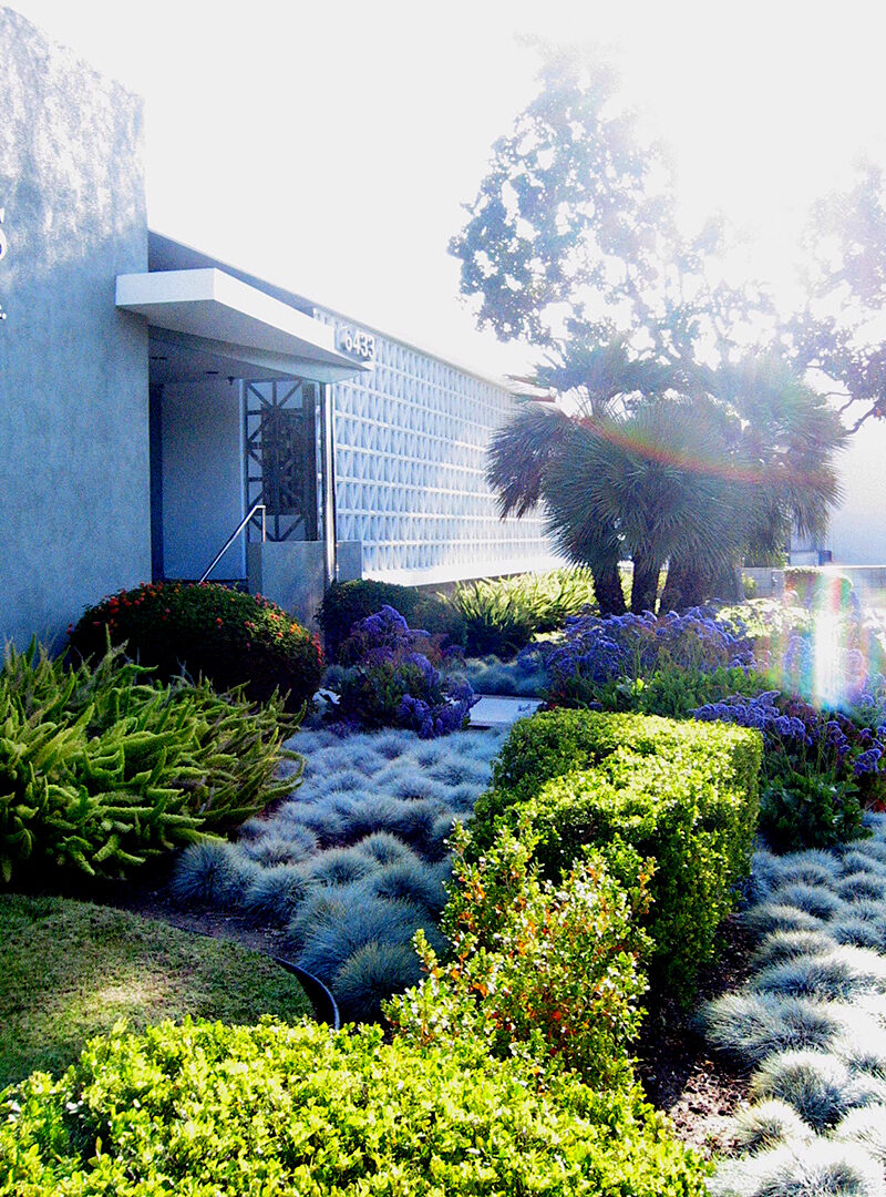
R&D facility landscape design
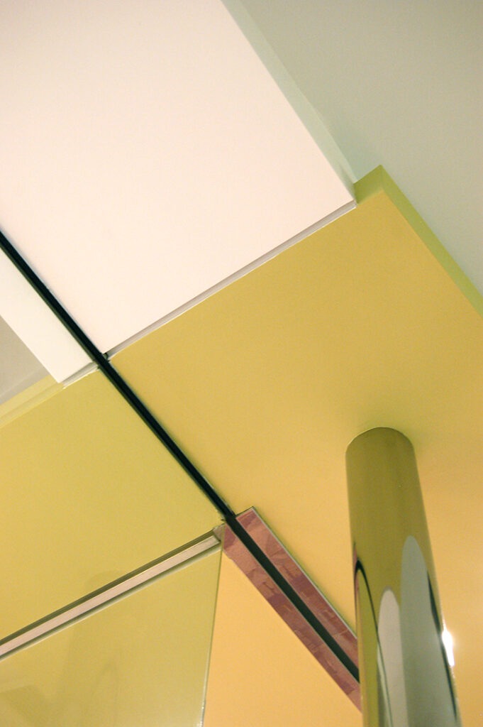
Showroom entry detail
showroom design
The Los Angeles showroom was located and renovated within the new R&D facility. It was thru the success of this renovation that Atlas decided to establish a Chicago showroom at the Mart for both NeoCon and year-round use. They wanted a space which could support the Midwest sales team and ship samples. They also wanted a space that could be customized year-to-year to support each year’s new product introductions, messaging and sales strategy without a complete renovation of the interior architecture.
After the completion of the Los Angeles renovations we created a subtle brand reference and experiential continuity between the LA facilities and showroom designs. Also, marquardt+ developed a custom, large-scale rolling panel, trolley and rail display system with chrome mounting bolts for multiple size sample mounting configurations into the interior architecture. This system could be reconfigured into any layout as required based on the collections, theme, flooring design and goals of the yearly presentations. Behind these panels we designed the more permanent spaces for reception, private offices, sample storage, conferencing and food/event staging.
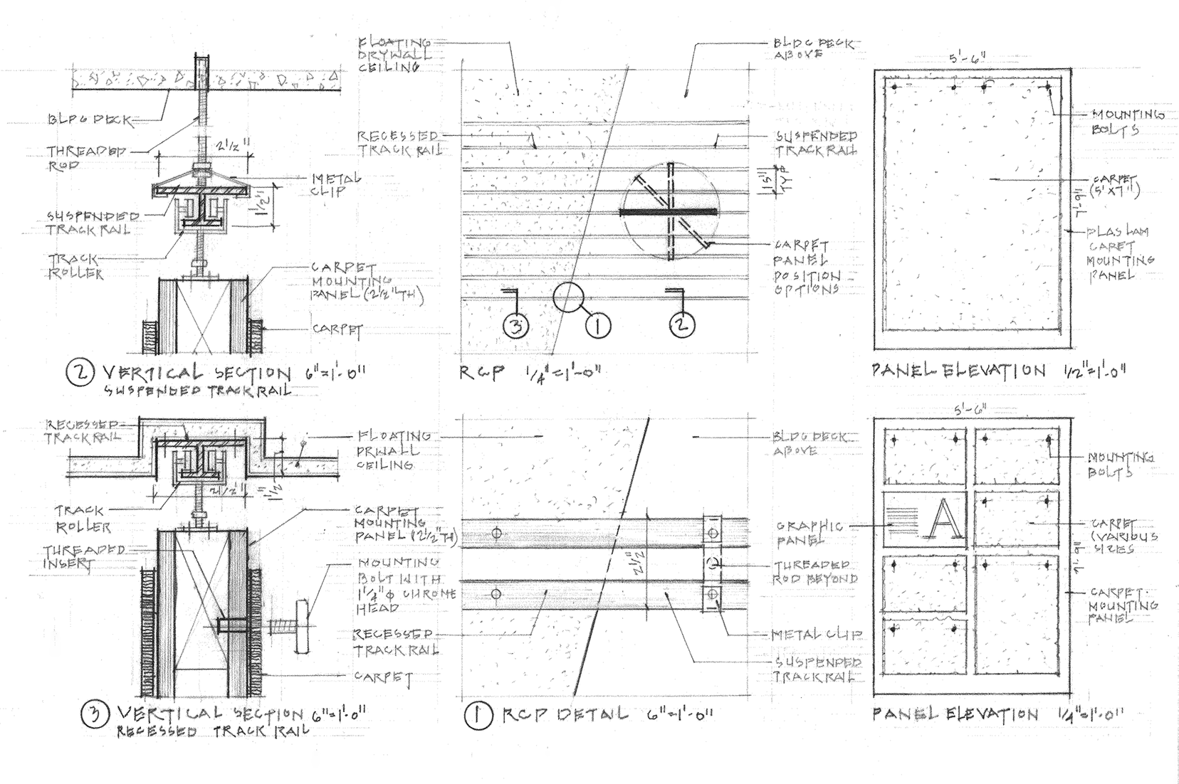
Custom designed carpet and rail display panel system
Left: Off-the-shelf I-beam and trolley rail; Middle: Rail and display panel detail with locks; Right: Panel display showing versatility of system
showroom adaptability
The showroom panel/grid system provided a transformational experience every year with new product displays and organization related to the new flooring layout and graphic messaging. Product display was incorporated into every permanent display space within the showroom, eliminating any “back room” space wasting, while still providing the required functions. This included utilizing a series of display panels on a rail to hide an 80 foot long sample storage shelf wall down the main corridor, allowing for sample stock to be shipped from the showroom versus Los Angeles and organized so they were attractive, even when exposed.
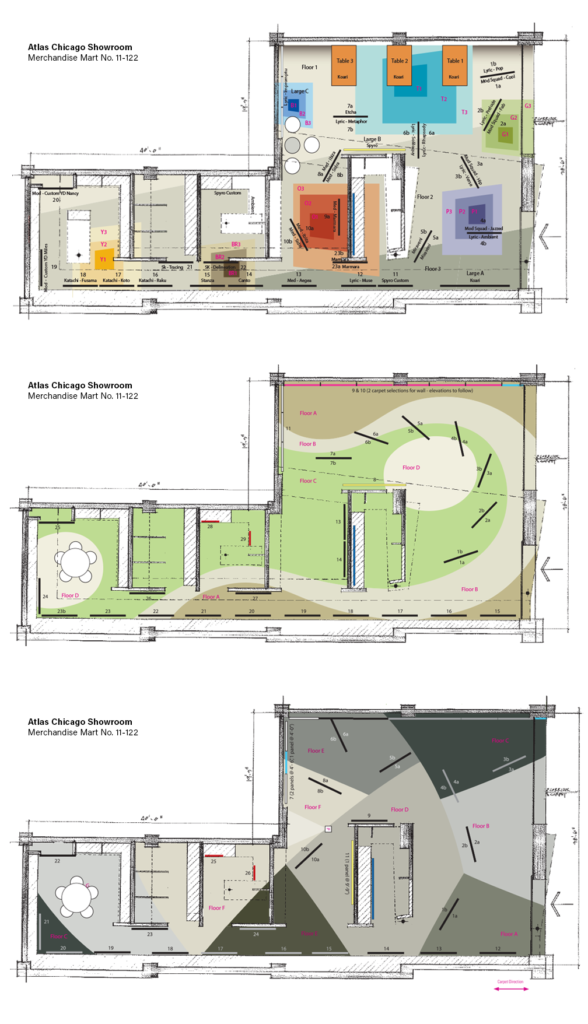
Yearly showroom transformation
The end result was a showroom sales tool that supported the product story as a visual narrative, and the continuity with the Los Angeles renovation details kept the showroom architecture restrained and minimal, while making the product hero. marquardt+ re-planned the flooring installation and panel layouts yearly, from the build-out debut in 2000 through their relocation in 2014, and then in the new smaller space thru to 2018, with fresh up-to-date presentations each year without any major renovation.
communication and graphic design, promotional elements
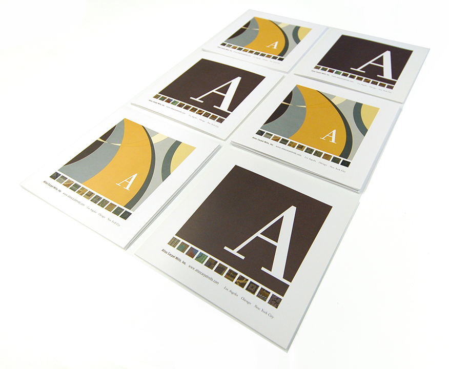
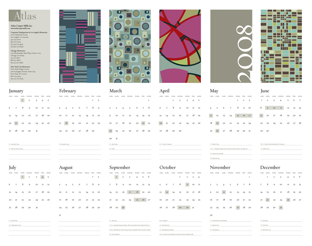
For continuity, marquardt+ also designed all supporting environmental graphics, theming, brochures, photography directing and styling advisement, promotionals, including updating the company carpet books, and creating a system of reference for the introduction of carpet tiles into the Atlas line. We designed and developed every touchpoint, from the simplest custom design of product tags to blotter calendars designers actually wanted to keep, along with promotional mailers and bags.
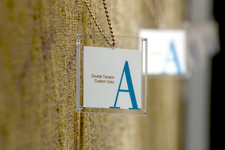
Product description tags
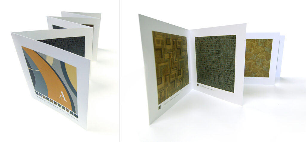
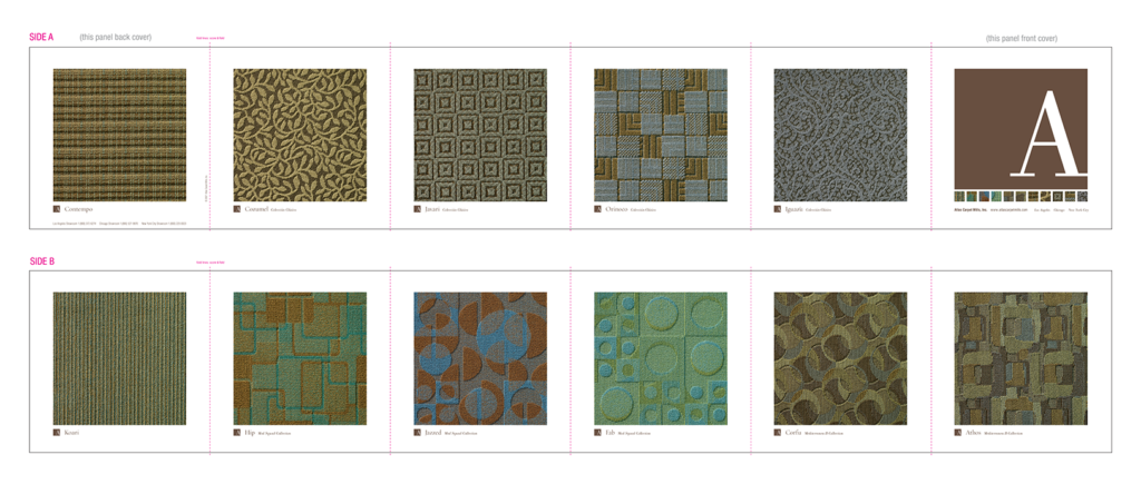
Product brochures
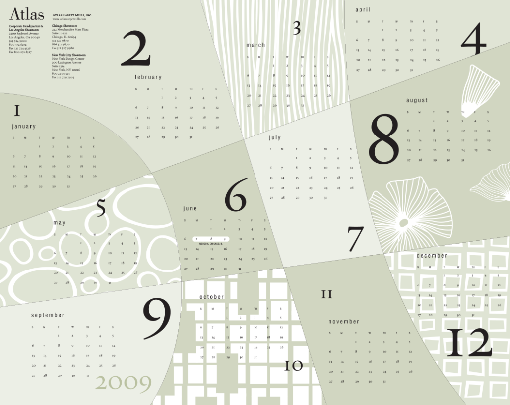
Design library calendars featuring Atlas carpet patterns as graphics
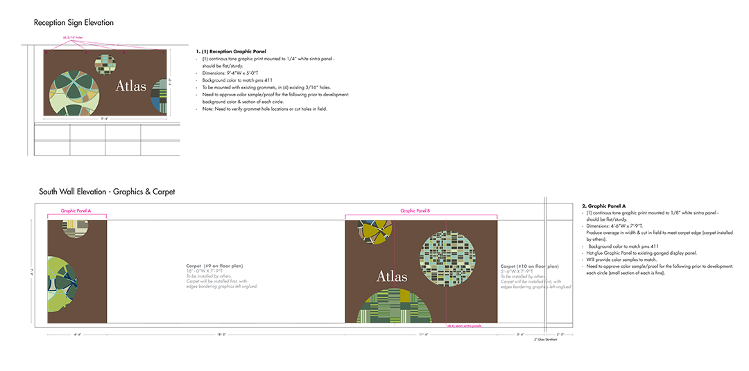
Showroom signage and graphics
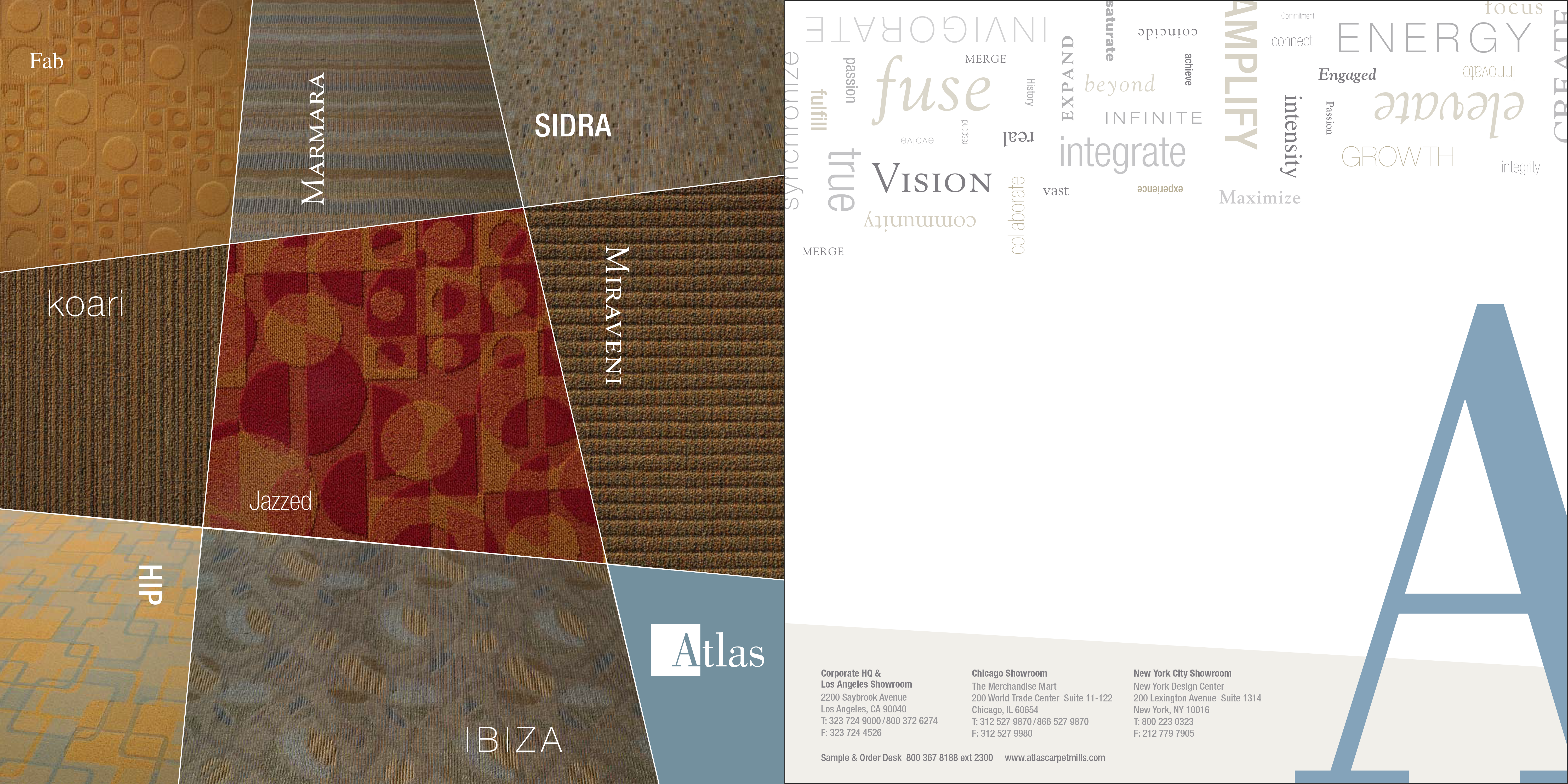
Print giveaway
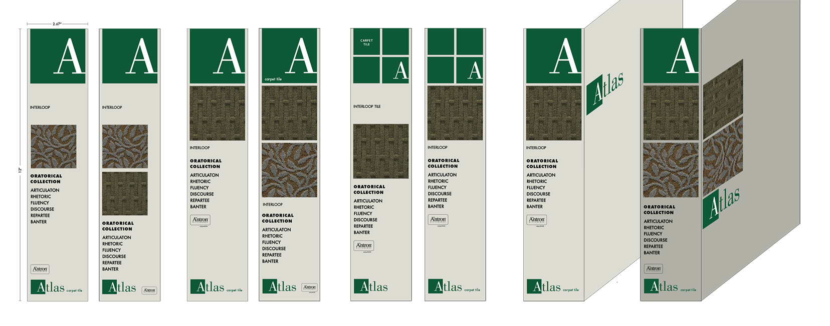
Architectural folder studies
showroom consolidation, and transition with merger and acquisition
Over the years we helped Atlas maintain their focus, and in 2014 as part of their consolidation in preparation for their merger and acquisition by the Dixie Group, we facilitated the Atlas showroom relocation. marquardt+ created a smaller more agile Chicago showroom space with a simpler more flexible display system providing the same scale of product display and yearly change out flexibility while reducing the square foot area and product display change out costs by almost 50%.
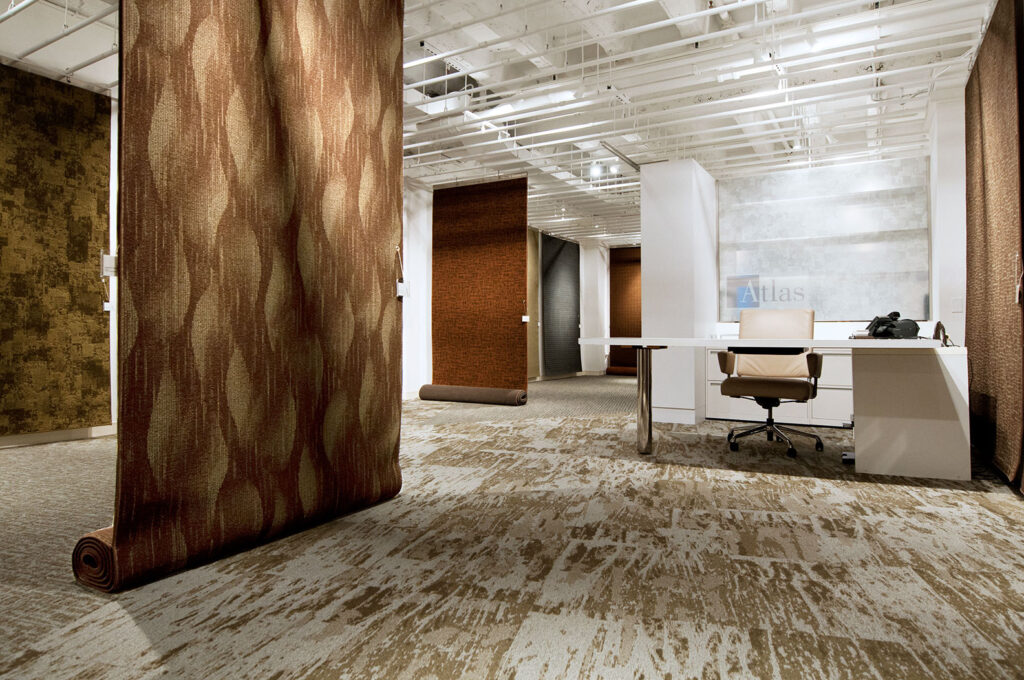
New showroom relocation and consolidation
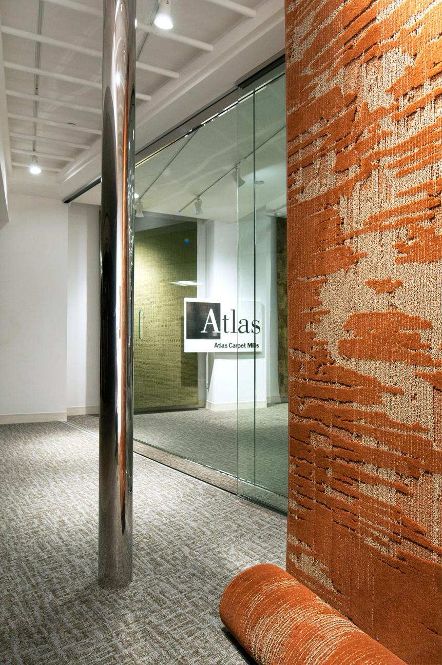
Entry detail utilizing all previous showroom components and storefront
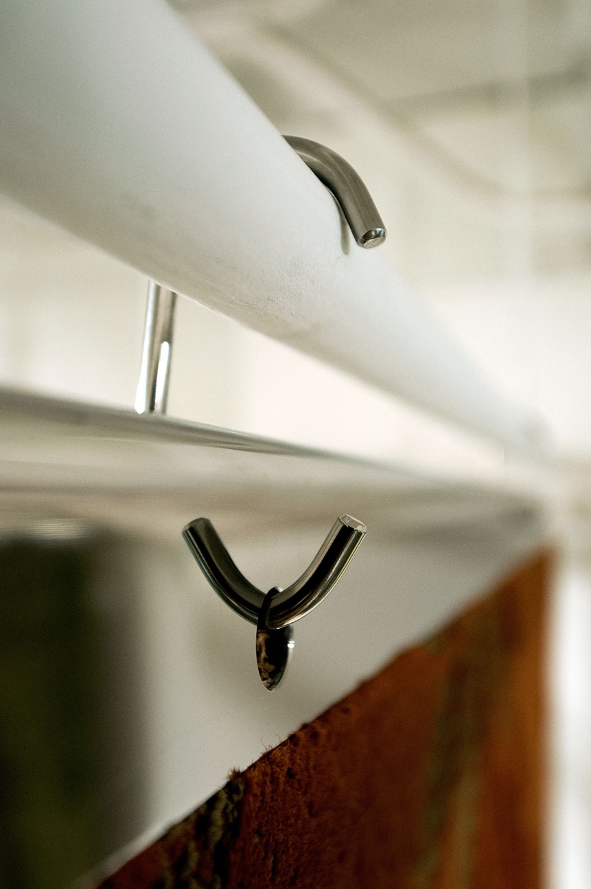
Detail new simplified flexible carpet display system
The Dixie Group subsequently retained marquardt+ to merge the Atlas Carpet Mills brand with their own commercial carpet division, Masland Contract. In 2018 and 2019 we facilitated a complete business, marketing and brand strategy integration to create a new single brand for both divisions renamed AtlasMasland capping off the exceptional legacy of Atlas Carpet Mills. We then continued to work with AtlasMasland until August of 2021 when the Dixie Group sold AtlasMasland to Mannington Flooring.
See the m+ AtlasMasland Case Study here.
design team, marquardt+ (work performed as Design Collaboratives)
+ Tom Marquardt
+ Vince Gammino
+ Mark Rupsis
+ Mary Beth Rampolla
+ Jim Wild
+ Billie Knipfer
+ Kelly Ziegenhagen
+ Gretchen Miller
+ Gisele Gieger
+ Lauren Haras
+ Katelyn Landeck
+ Jaysen Goranson
+ Gabby Miller
+ Marcus Saldana
+ Don Kimpling
+ Bill Daukus
+ Katherine Putnam
+ Erin Patterson
Photography: marquardt+, Michelle Litvin Photography
